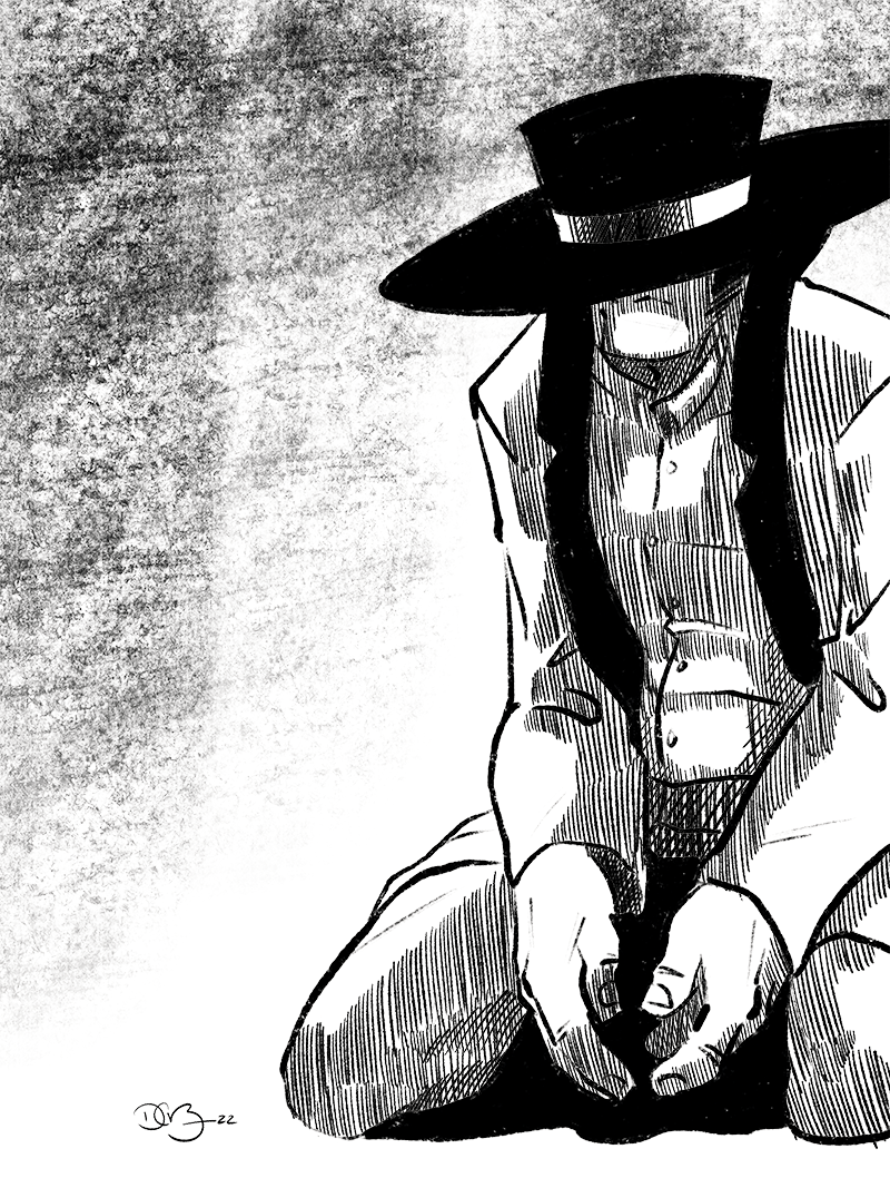
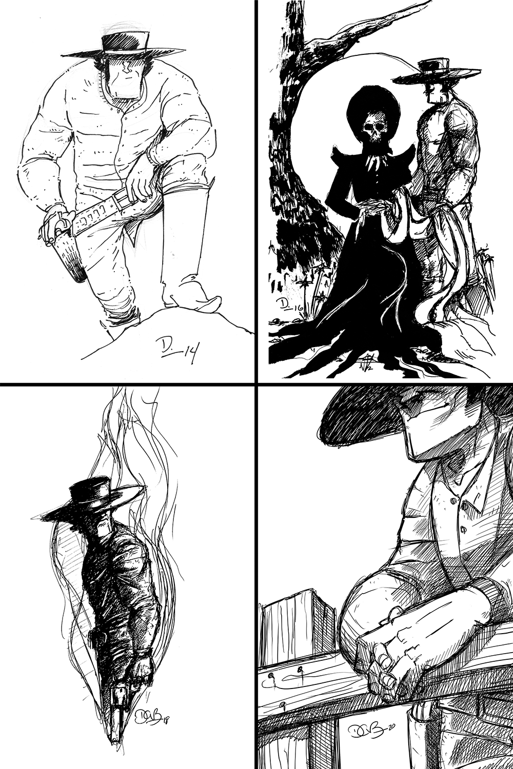
Sketch Fridays #90 – Frontispiece
Tradition is only created when people choose to carry over qualities or behaviors they feel are beneficial. I’m at the designing stage for the book of Long John Volume 5 and I’ve noticed that design traditions have carried over from book to book, making them expected and necessary even if they go unnoticed.
There are more obvious elements, of course, like font choice and the logo. However, there are more subtle choices––the back cover and the inside back cover are always the same; the “Looking Back” at the bottom of the inside front cover is always a terse and abstract recap of the previous volume (an idea stolen from Cormac McCarthy’s chapter descriptions in his horrifying book, Blood Meridian); of course, there’s what I call the “white page” at the end of the story content of each book (something I started doing with my previous comic series). Then there is the frontispiece.
Although I’m being a bit liberal with terminology here, a “frontispiece” is what I’ve come to call these drawings. Technically, a frontispiece is an illustration on the facing page to the title page of a book. It’s on its own standalone page and is not printed on the inside front cover of the book. Also, since the title of the book is also on this page, that would technically make my inside front cover the title page, but that does not excite my snooty tastes.
The frontispiece for every Long John book has been unique (some of them have even been featured Sketch Friday drawings), though only the frontispiece for volume 1 was explicitly created for the book. The illustrations featured in volumes 2-4 were all sketchbook drawings––ball point pen drawings made either to 1. come up with ideas for the cover or 2. find a “tone” for the upcoming chapter to be written and drawn.
Volume 5’s frontispiece brings it back to the first volume and was created solely for the purpose of being a light illustration behind book information. However, like those that came before, it is emblematic of the themes and tone of the story it precedes. One could even view it as an “after” drawing for the cover’s “before.”
It’s a tradition I look forward to, whether created in a moment of inspiration long before I’ve started the book or drawn in a fit toward the end of a book––it’s a fun chance to be poetic with a character who runs around in his underwear.


Discussion ¬