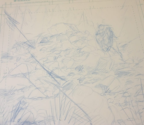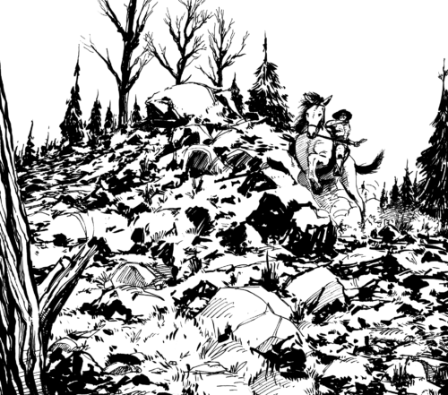
Sketch Fridays #42 – Chapter 3 Preview (pencils and ink touch-ups: D. Bethel, Inks: Josh Tobey) Click to enlarge.
Mid-July was a fun month despite most of the time being spent in over 100-degree weather. As I mentioned on the website (in video format), July 15th was the inaugural Sac Indie Expo and it was a lot of fun. For me, the best part of it was that old friend and artist, Josh Tobey, came down to visit for the event (as well as to hang out) and it was a blast.
When we’re hanging out, Josh and I talk a lot. Like a lot. Mostly about art and creative goals and the like. He’s developing a comic project right now, so I’ve been doing my best to provide feedback and give encouragement at every turn because this project needs to happen (what I’ve seen so far is incredible). I remember at the show, we talked about Long John. I showed him what I’d done so far and some pages that weren’t yet inked. There are a few pages in the middle of the chapter that are basically just landscapes, and I mentioned how I was scared to death to ink them if only because I don’t feel fully confident enough to render them convincingly with brushes and pens. Give me faces and poses until the lights go out, I have no problem approaching them with the permanence of ink. But when it comes to natural settings, I still tense up, worried that I might get them wrong, somehow. I relayed those fears to Josh during one of our many conversations at the show, which guided things in a very interesting direction:
“Oh, man,” Josh said. “That’s the fun stuff to ink.”
“What.”
“Yeah, you don’t have to focus, really. Just filling in what needs to be filled in,” he said.
“Well, if that’s how you feel,” I said. “Why don’t you ink these pages, then?”
“I don’t know, man.”
“Why not?”
“I don’t want to mess with your style. You draw Long John very specifically,” Josh said.
“Well, then, I’ll ink him. You ink everything else,” I said.
“That sounds doable.”
I laughed it off. When we got home, we ended up watching a movie and just hanging out. But then Josh broke into the proceedings with a simple question.
“Hey, man. You want me to take a stab inking those pages?” he said.
“Are you serious?” I asked.
“Yeah, why not? It sounds like fun.”
Having learned to accept any help when offered, I bolted upstairs and grabbed the pages. We talked about what it should look like and went over the pencils a bit and then, for the first time in my life, I handed off my work for someone else to ink.
I wasn’t scared to hand the pages over; I have complete faith in Josh’s abilities. I was worried that he would have to guess too much, that I hadn’t provided enough information or guidance and what I would get back would be Josh art and not an inked D. Bethel Long John page.
But the results look amazing. I came back about mid-way through and tightened up the inks on the horse and inked Long John, but with the rest he made exactly what I saw in my head (but better). Even though it looks like a skilled inker took up the brush and brought it to life (because one did), it’s still what I drew on the page. Since I ink my own stuff, I put down very loose pencils. What was comforting was to find that even my loose pencils can be enough to guide someone else with the inks. Albeit, someone who is very talented and has utmost confidence in his ability. I’m not saying I’m going to start divvying out inking duties, but it’s nice to know that, perhaps, that option remains open.
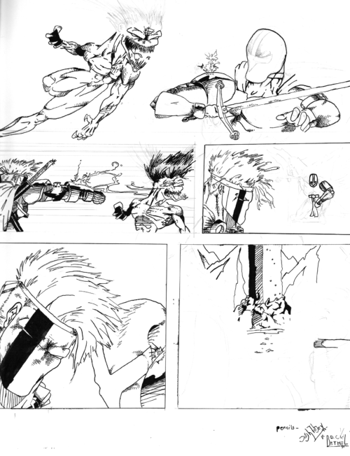
D. Bethel mostly inking Josh Tobey pencils of a medieval Katana & Venture adventure from 1995. We didn’t know official comic page sizes or anything, so it’s much wider than it should have been. The only time that I know of that we collaborated before.
More than anything, aside from a few instances in our youthful drawing days, Josh and I had never really made any art together. I shouldn’t be, but I was kind of surprised at how well we worked together. Less wanting to hire an inker, I now daydream a bit about not only making stories with Josh but specifically making art with him, which I had never really considered before.
