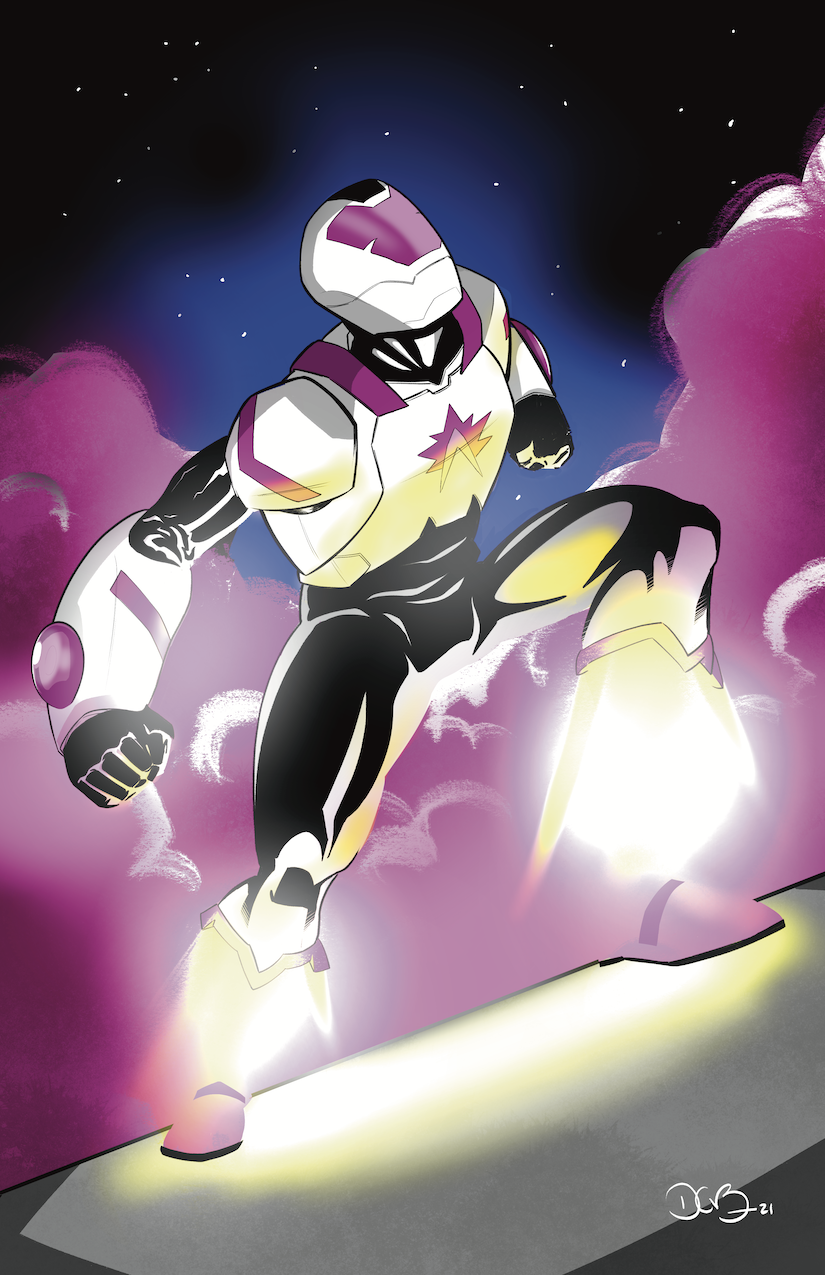
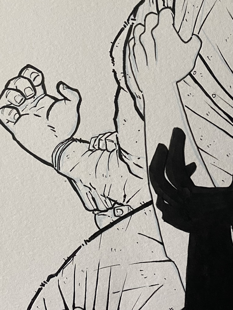
This is a drawing I did of a character by my friend and local comic creator, Kyrun Silva (of Taurus Comics), that he intends to debut shortly. It was meant as further practice for drawing on the iPad, but it turned out well enough that I sent it on to Kyrun to do whatever he wants with it as he prepares to launch a Kickstarter.
I realize every time I post a drawing from the iPad on here, I say it’s “for practice.” Though I’ve had the thing for almost two years, I don’t feel comfortable with it as a tool for creating finished artwork. Part of my issues are tactile––the float of pen across screen––another part is just unfamiliarity with the nuances of the program. I have used Photoshop since 1999 or so, so that art program has fully soaked into my cellular structure and trying to learn any other program has been Sisyphean as a result. There are workarounds to my issues. There are overlays I can put on the screen to make the pen drag feel more like paper. Obviously, the more I use Procreate the more comfortable it will become. But the distractions are enough to keep me from picking up the thing in the first place.
That being said, I do use Procreate and the iPad for professional purposes. I created all of the layouts and thumbnails for Chapter 5 using the program and other, smaller stories, and I genuinely don’t think I’ll go back. It’s perfect for that task.
For this drawing, I put the machine to the test to make as finished a drawing as I could make from scratch, digitally. I focused mostly on the figure itself, and am pleased with the line work and rendering I was able to lay down. As you can tell, I went wild with some of the effects. Starcore has a propulsion system that allows him to fly via jets/vents in the shins and calves. One of my goals was to create the sense of compressed energy, built up to launch a guy in a machine suit into the sky. It was fun to play with the menus and options that I don’t normally get to tinker with for Long John.
It was a fun drawing to do, though I can’t help but think about ways to continue tinkering with it every time I sit down to look at it. Kyrun liked it, though, which is the most important thing.
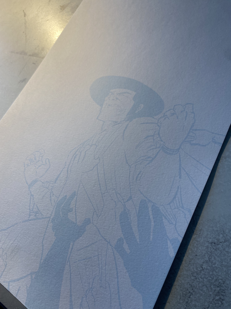
Digital “pencils” printed onto 11″x17″ vellum bristol. Click on the image to enlarge.
I’ve been inking the cover to the next Long John book and I’ve been trying something brand new with this.
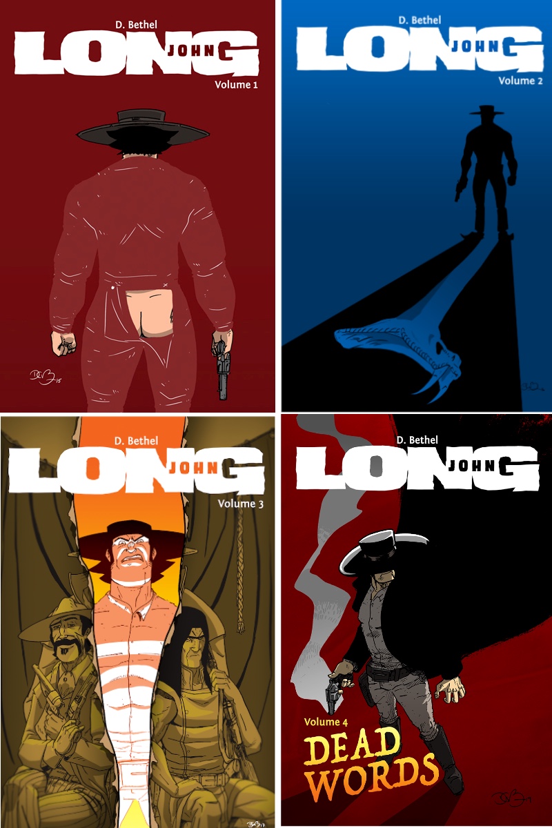
Normally, the creation of the covers has been informal at best and haphazard at worst. The first book’s cover was me taking a drawing I did for a bookmark design that featured half of Long John’s backside. I found the original art, made a copy of it onto printer paper and finished drawing the other half. Volume 2’s cover was a digital drawing of a quick sketch I had made in a sketchbook. Volume 3 was the only one I had actually drawn and inked on full size bristol board (standard comic book paper, in other words). There was some shenanigans, however. The drawing on the 11×17 bristol is just the daguerrotype of the three Johns, including Long John in his old clothes. Then on a separate piece of smaller bristol, I drew the tear with the angry Long John peeking through. I then mixed them together in Photoshop. Volume 4’s cover was just a practice drawing I did one day. Once I finished it I thought, “Heck, that would be a great cover.”
The four covers of Long John so far. Click to enlarge image.
Needless to say, while I tend to be a stickler for how the pages themselves get drawn, I’m much more liberal when it comes to creating the covers.
I’ve been working with the iPad Pro (and the drawing app, Procreate) for about a year, now, and I’m still trying to find the best way to insert it into my process. It has become my preferred method for thumbnailing pages, but it’s such a powerful tool that it seems like it could be much more useful for me.
I have been hearing for years of artists who “pencil” their pages digitally and the print them out in a light blue or red ink and ink over the printed lines. I always doubt the quality of my own equipment, so I figured that would be a good method for someone with really expensive…everything. However, I had been messing with cover ideas digitally, and even considered making the cover completely with digital means. As always, I got frustrated when trying to create a finished piece of art, but I had the worked-out sketch. So, I gave it a try.
I pencilled the cover digitally on the iPad Pro using Procreate. I was able to print them out on some unlined bristol (even if it is vellum bristol, ugh). The results were really impressive.
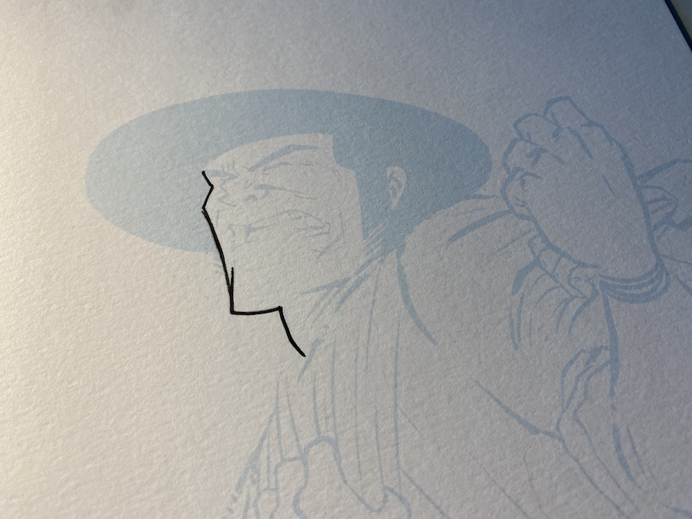
Inking the pencils. Click on image to enlarge.
I was most interested to see how well the printed lines would take ink (since it had already been printed on), but it hasn’t been an issue at all (aside from the basic issue of it being vellum bristol. Again, ugh)! Honestly, this experiment may have fully changed things for me in terms of process and am excited to do more practice and experimentation with this method. Let’s just hope it scans as well as the blue pencils I use to normally pencil.
Close up on some final inks. Click to enlarge.
As for Chapter 5, I’m deep in the flatting stage right now (as discussed last week) and am trying to get as much done before a lot of work comes in from my day job, work that will keep me occupied for the next few weeks straight. Wish me luck!
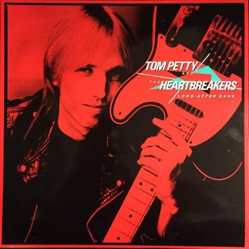
Long After Dark by Tom Petty and the Heartbreakers. Image Source: Backstreet Records/MCA Records/Geffen Records
Long After Dark by Tom Petty and the Heartbreakers
In the summer of 2020, my great Queen listening journey came to a close. It was an invigorating task to listen through a band’s extensive discography on a monthly basis from start to finish. I honestly never thought I’d make it through the entirety of Queen’s catalogue, and when it ended my first thought was, “that was fun,” before thinking, “that was easy.” The last thought I had was “who’s next?”
My Queen journey started because I was challenged as a “real” fan of Queen. However, even by my own metric I wasn’t one; so, I figured I’d make myself one or not. Now that task had ended, I figured I’d reflect on any other musicians I claimed allegiance to but, when inspected closely, I didn’t actually have a strong grasp on. Though a few bands came to mind, I settled on the challenge that I figured would be the most fun: the discography of Tom Petty and the Heartbreakers (with the solo Tom Petty albums shuffled into the mix).
As of this writing, I am at the tail end of his sadly shortened (but very long) career with a mere two albums remaining: the Heartbreakers’ Mojo (2010) and Hypnotic Eye (2014). Overall, though, bouncing through his catalogue has been a more muted affair than it was with Queen. Queen relished in experimentation and musical diversity, mostly emboldened by the fact that it was a band comprised of four unique songwriters.
Image Source: Backstreet Records/MCA Records/Geffen Records
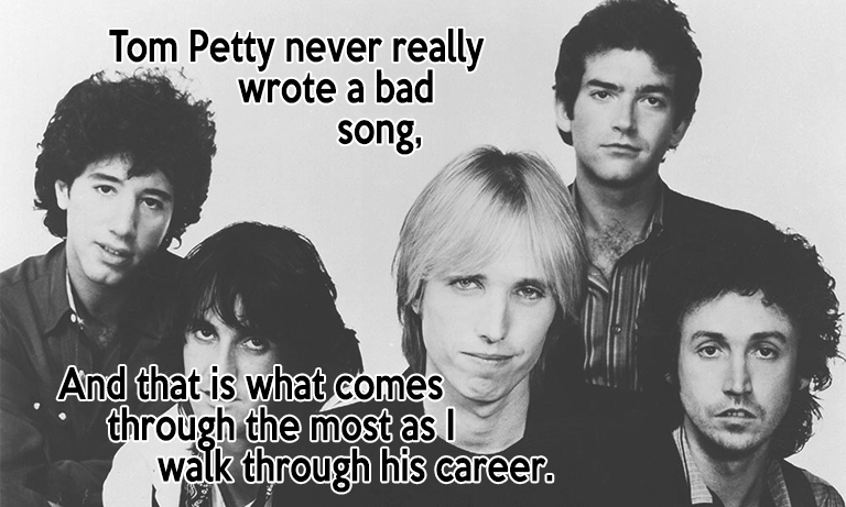
Tom Petty wrote every song in his catalogue (with only a few exceptions––a lot of co-writes and very few covers), so there isn’t a lot of surprise along the way. The worst comment I can make about an album is that it “sounds like a Tom Petty album.” Before I attract undue ire, Tom Petty’s worst is better than many bands’ best.
Even with the albums I haven’t cared for as much, they are still packed with jangly guitars and hummable melodies that dig into your brain, popping back out when you least expect them to. Bland or rocking, profound or superficial, Tom Petty never really wrote a bad song, and that is what comes through the most as I walk through his career. But there is a sameness which has colored some listening experiences, even though it has me tapping my foot with every song along the way.
As I near the end, the album I keep coming back to is 1982’s Long After Dark, his fifth album that capped the end of the hot opening stretch of his career (it slumps for a little bit before roaring back with Full Moon Fever, his first solo album). It’s not that it is especially better than other albums from this first run, but, to my ears, it’s the most solid front-to-back album experience with an incredible run of amazing songs in the middle of it. While other albums may have better songs (and more successful songs) and this album may have one major clunker (sorry, but “You Got Lucky” is not good), Long After Dark is the textbook definition of the opening era of the musical persona called “Tom Petty and the Heartbreakers.”
WATCHING:
Image Source: Netflix
The Harder They Fall on Netflix
I certainly don’t include myself in the mix at all, but after a long dormancy, it seems––in small, quiet steps––westerns seem to be edging back into the public sphere. With the triple threat of HBO’s Deadwood, Rockstar Games’ Red Dead Redemption, and Quentin Tarantino’s Django Unchained straddling the opening decade of the new millennium, all three presented unique, different, and distinctly modern approaches to a genre that many considered tired and dried out. The best part about all of those examples is that while they feel modern and new, there was no denying their classic western influences which they all wore on their sleeves (especially the latter two).
Since then we’ve seen entries like Netflix’s Godless (which was only okay), Rockstar’s triumphant return with the sublime Red Dead Redemption 2, and the Coen Brothers’ outstanding adaptation of True Grit (not to mention their bizarre but fun Netflix anthology film, The Ballad of Buster Scruggs), all of which speak to a healthy heartbeat for the genre.
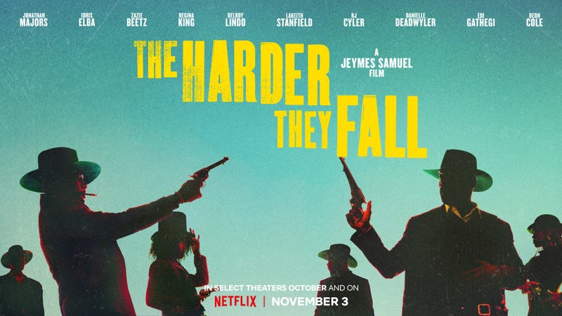
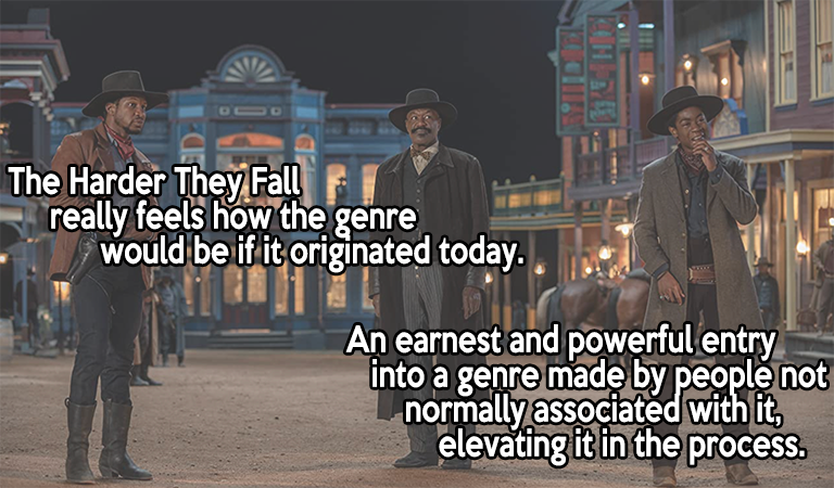
Netflix continued the lifeline with their recent release of The Harder They Fall, directed by British musician and filmmaker, Jeymes Samuel, and starring a bevy of amazing talent: Idris Elba, Jonathan Majors, Regina King, Delroy Lindo, and Zazie Beetz, to name a few. Together, they created an incredibly stylish, stylized, and modern take on the Spaghetti Western. Of course, all the previously mentioned titles (with the possible exception of Deadwood) all scoop from the Spaghetti Western pot, but The Harder They Fall really feels how the genre would be if it originated today. The colors are bright and coordinated. The gun fights are romanticized, stylish, and over the top. The characters are arch and easily readable. This film is pulp fiction in its truest sense. It’s an earnest and powerful entry into a genre made by people not normally associated with it, elevating it in the process, which is the heart of what Spaghetti Westerns did in the ’60s.
Image source: Netflix
What makes it stand out is that the majority of the characters in the film are all based around real people: Bass Reeves (probably the most well-known of the bunch), Nat Love, Rufus Buck, Bill Pickett, Stagecoach Mary, and a bunch more. However––and it can’t be impressed enough––this is not a historical story by any means. But it doesn’t matter. True or not, it’s bringing attention to legitimate badasses of the wild west, elevating their names to a higher platform in pop culture that they surely deserve (seriously, look up any of those names and just read at how unequivocally badass all of them are) but have been denied such attention due to being black at a time when the exploits––both as heroes, anti-heroes, and outlaws––were not recorded nor capitalized upon like their more famous white colleagues.
What The Harder They Fall does, though, is focus on being the most awesome and fun and action-packed western they could possibly make, and they did so with aplomb. Historical or fictional, traditional or progressive, this movie was so much fun from start to finish.
CHAPTER 5 UPDATE
A look at what a script for Long John looks like.
As of this writing, all of the lettering is done for Chapter 5. That means the script is locked down and all the dialogue and captions have been digitally added to the art. This also means that most of the dialogue also has word balloons behind them, save the few where I want to see how the coloring of that panel turns out first.
What comes next is the two-phase process of coloring.
Phase 1 is called “flatting” which means going through the pages and dropping flat colors in each panel––the most basic coloring. What this does is separate the elements of each panel from each other––characters, foregrounds, backgrounds, props/items––by giving them distinct or different colors which will make the next phase easier.
Phase 2 is shading and highlighting. With the flatting done, I then go back through the pages and start “rendering” the images: adding shadows and highlights on the figures and backgrounds and anything else that makes them look like the comic exists in a bit more of a believable and fully realized world.
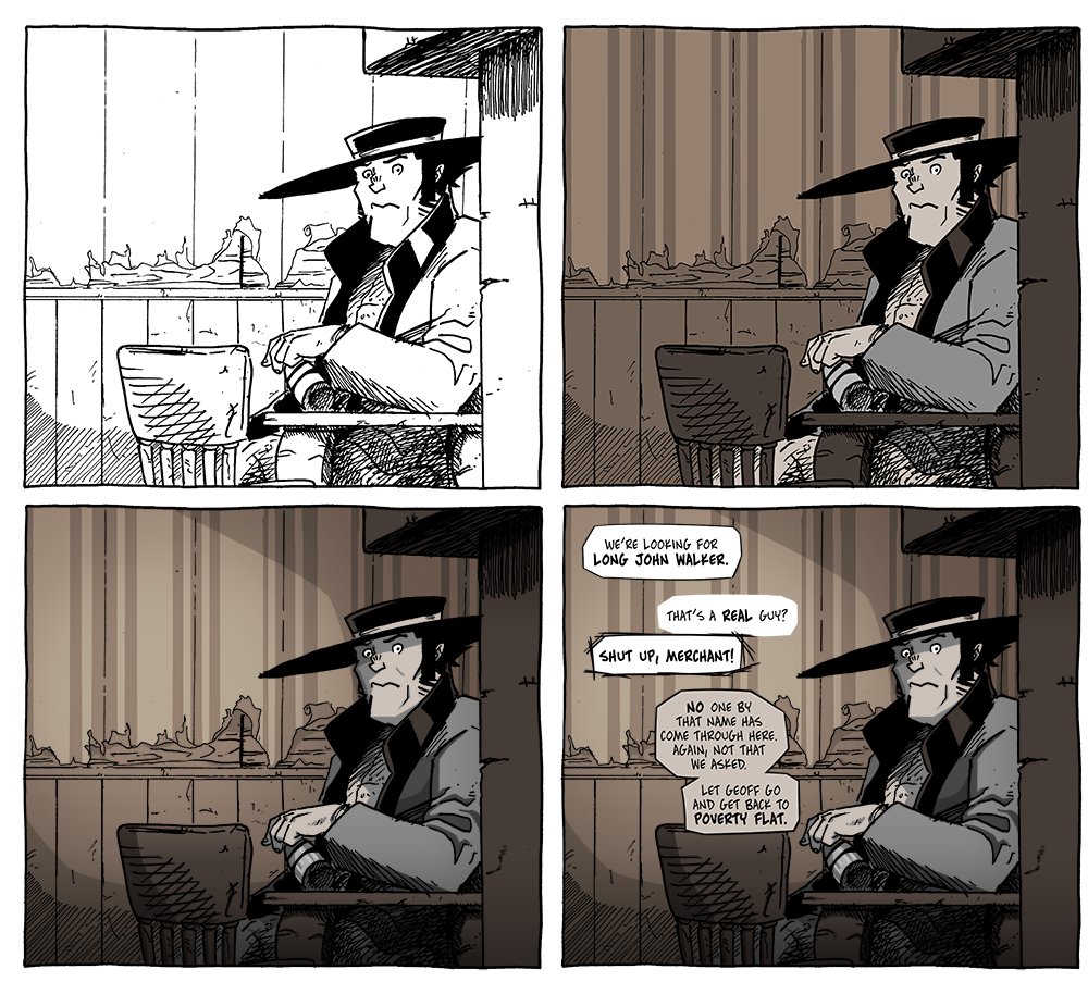
A look at the process after drawing. Top Left: scanned lines. Top Right: flat colors, Bottom Left: shadows & highlights, Bottom Right: dialogue added. (from Chapter 4: “Words Apart”) Click on the image for a larger version.
Flatting is the part I look forward to the least; it’s tedious work, but it’s necessary work. It’s best to do all the flatting first and then go through and do the shading because otherwise every page would take forever and I want to feel, at least, like I’m continuously making forward progress.
There are some art corrections I want to make and even some other things I want to/need to draw to really flesh out the book. So, there is still quite a road to drive down, but the hardest work is over. Now the boring drive straight down the long, empty highway begins. At least the destination will be nice.