Of the many things I’m trying to do with Long John, one of the less discussed aspects here has been my aesthetic goals with the comic. What often surfaces in conversations I have with other creators and in interviews is that I, personally, straddle the highbrow and the low––I’m simultaneously a university professor of English,a and a guy making comics on the internet.
The move most likely assume I would make as an academic who makes comics is that my work would be much more subdued than it is or, at the very least, than how it looks. When thinking of capital-L Literary Comics, many automatically conjure works like Maus, Blankets, Persepolis, the creator-owned work by Jeff Lemire like Essex County, or the more stripped down esoterica of Chris Ware.
In contrast, as existential and navel-gazing as Long John‘s story is, my artistic style features heavy nods to animation as well as the anatomical exaggerations and layouts of superhero comics. I’ve made no secret of my nostalgic love for superhero work. I even admit that I’ve gone back to reading much more superhero comics in the last year, diving into the deep end just to see what all the fuss is about. Though I’m reading more of it, my consumption seems to be mostly academic rather than as a fan––I’m interested to see how modern superhero comics work more than being eager to stitch together the threads of continuity from my childhood together with the modern. Needless to say, the stories they tell don’t have much bearing on the one in Long John, but it has ignited an open awareness and acceptance at the root of my artistic style.
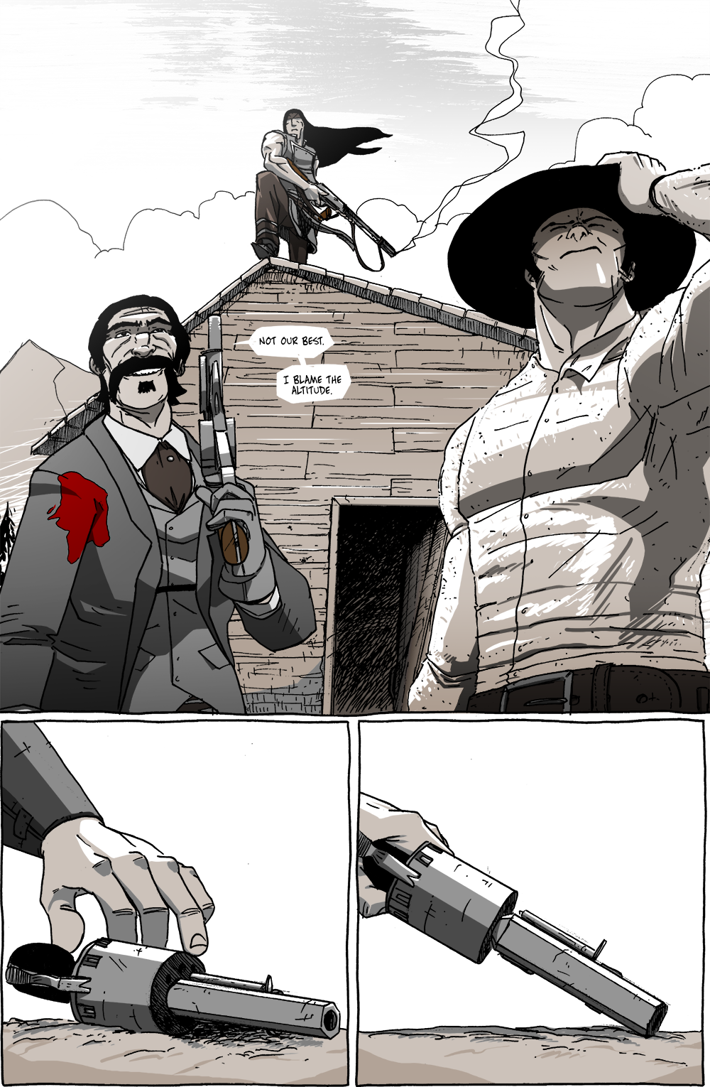
Today’s page has an unequivocal “hero shot” of the Johns. In its composition I really leaned into the main goal for most superhero comic artists––especially from my days of fervent reading in the 1990s––asking, “how do I get this to look as cool as possible?”
In this chapter especially, this “cool” factor became even more of an aesthetic metric because of the inherent discord using such poses and angles brought: these characters are anything but heroic; the violence is anything but glamorous. Instead, it’s what they see themselves to be, which is why we contrast the cool-looking shots with the awkward, uncomfortable, and gross panels of people getting shot as a result of Long John’s “heroism.”
However, there’s also my push back against the idea that more literary comics can’t share aesthetics with more dynamic and exaggerated stylization (when warranted). Like a lot of “indie” music, a lot of people automatically assume a certain collection of choices and stylings that pigeonhole these non-mainstream books in the same way we pigeonhole mainstream books. I’m not saying I’m doing anything groundbreaking here––in fact, it may be a direct result of not wanting to push myself artistically––but it’s a specific choice that I’m proud of using in this comic, even more so if it helps drive home the points I’m trying to make to the reader.
There’s no intent to put Long John in the same realm (or even with the same audience) as superhero comics, but that doesn’t mean their visual language is invalid. In fact, that language became a pretty foundational one for me even if I steered off into other directions. But there are a lot of creators like me, people who want to say something with their works who have a foot planted firmly in both popular and artsy-fartsy realms. As a result, many works today are entering literary or artistic territory by mashing up popular genres––think about how something like The Dark Knight or Birdman or Pulp Fiction transcended their obvious genre to become something highbrow connoisseurs watched and enjoyed––I argue the same can be done by mashing together disparate aesthetics for the sake of making people look twice. Most western comics are highly realistic and cinematic, most literary independent comics are static and sparsely drawn, and most superhero comics are energetic and dynamic. With hope, Long John merges the three into something special and, with hope, powerful.
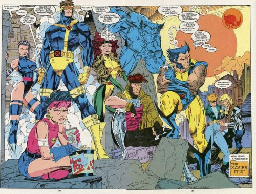
That being said, I can’t help but see pages like today’s and think, “that is pretty cool,” as the lowered perspective and careful placement and posing of the figures pushes the same button as seeing cool hero poses of the X-Men did for me as an eleven-year-old.


Discussion ¬