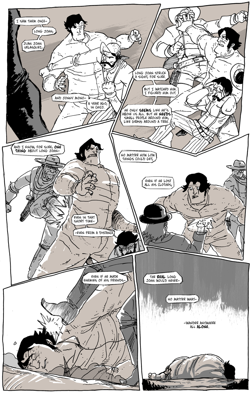
Struck a Sight
Another thing I’m not especially fond of drawing are fight scenes (add it to the list). However, my reason against them is deeper than the usual explanation of “it’s hard to draw.” The difficulty is actually the lowest issue in the hierarchy.
My main issue with fight scenes actually spans across all media that fight scenes populate––movies, television, video games, as well as comics––but it’s a fundamental problem with comics, in my opinion. What it comes down to is that fight scenes take up a lot of space, and space on pages and pages in books are precious to a comicker. However, to many fans, popular American comics (re: superheroes) are all about fight scenes––that’s what fans want to see. It was a common response to Eben07, especially in the early days; people wanted more action scenes (in the most recent Eben07 story, however, I did happen to write and draw a fight scene that ran for two issues, but it helped my thoughts on fight scenes congeal). I surmise that people want something cool to look at, though, and don’t particularly care what that action/fight scene is doing.
Manga––especially a lot that comes out over here in the states––tends to be fight scene heavy, and dozens of pages go by where nothing happens but punches and grimacing and very intricate and technical artwork. For manga that may be fine because they tend to be serialized works in phone book-sized weekly anthologies, but when reading for a story a lot of the action falls flat.
If I am going to have an action scene, it needs to be doing something aside than have action––it needs to be moving the plot and the character forward. That is, it needs to do the same thing that every other page of Long John does.
–––––––––––
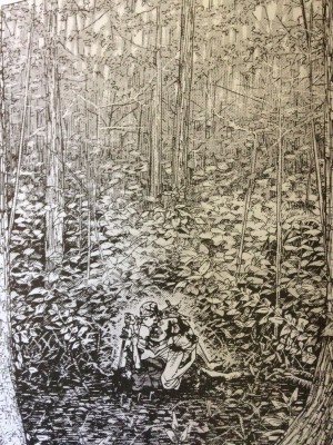
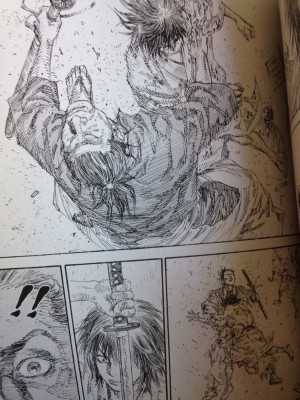
The fight scenes I’m most impressed by are––and here comes the Long John buzzword––those that are expressive in their storytelling and their linework. The artist whom I wanted to emulate the most was actually a style that I’m not comfortable enough to try, yet.
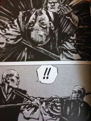
Takehiko Inoue is a Japanese manga artist who creates Vagabond, a pseudo-historical-but-mostly-fictional biography of the famed swordsman, Miyamoto Musashi (he of The Book of Five Rings fame, for those in the audience with MBAs). His artwork is intensely realistic, but he is incredibly adept at switching media in order to intensify the emotional state of the characters. He regularly (and unapologetically) bounces between fine pen-work, sumi brush-work, and watercolors, but it all has a point and purpose.
When it comes to the fight scenes (and if you know anything about Musashi, there will be many), Inoue has some of the most expressive art, even when it’s just Musashi standing there attempting to intimidate an opponent. It’s a technique I would like to adapt to Long John in some capacity, and today’s page was kind of a first step in that direction, using color (the main medium for thematic artistic expression so far) and custom brushes (I can’t remember from whom I got the brush, all apologies) to try and show less of a fight scene and more of a humbling of the hero.
So, for the first time, I think, I had a lot of fun drawing a fight scene.


Discussion ¬