Good Faith Gone Bad
Just over a year ago, I gave a talk to an upper-division Graphic Novels as Literature class at my local university not as a teacher but as a comicker.
One of the things I emphasized in my talk was the importance of weight. You can have the most dynamic poses with wild action and ridiculous foreshortening but if you can’t draw somebody who looks bored then you need to try harder. Character designs are important, of course, but we connect with characters in visual media first by how they interact with the world around them. They have to pass the test of believability before we can start caring about their motivations.
This is important for the drawn visual arts because it can be hard to do, and it’s not always necessary. However, it is how the character inhabits their world that creates a basis for our––as the audience––understanding of it. It’s much easier for acted visual arts because, in theory, actors have sets and actual ground and other people to interact with. But with drawn visual arts, we not only create the characters from nothing but their world as well. And if you’re trying to create a specific mood in a scene or establish the personality of a character in a scene, the easiest and fastest way to do that is to show their weight in that world.
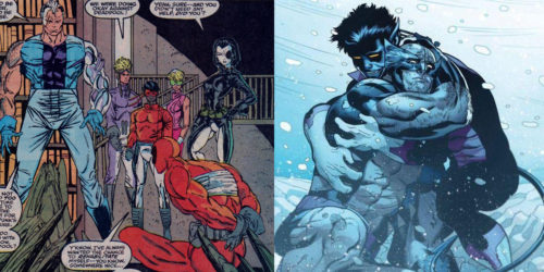
The example I used in the talk drew a contrast between a panel from Marvel Comics’ New Mutants #98 (1991) drawn by Rob Liefeld. As a panel, it does its job: the protagonists are clearly visible and inhabit the room, the villain is tied up and is at the mercy of the heroes. Upon further inspection, however, you can see inconsistencies that, when seen, can take you out of the moment, but can keep you from becoming fully invested in the emotional moment of the scene (whatever that emotion may be). The villain, Deadpool, has his hands tied behind him, and one of them is drawn backwards. None of the protagonists in the background seem to be standing on the same plane. The compositional elements all point toward the crotch of the main figure, Cable. Again, it does its job (and it sold very well), but there is no connection we really have with the moment or the characters because the characters aren’t “in” their world. I contrasted that with a panel from Amazing X-Men #4 (2013) penciled by Ed McGuinness. Here, without any dialogue or even a detailed background we know immediately it’s a powerful reuniting between two people who care very much for each other, and it’s clearly been awhile or they have just gotten through a rough situation.
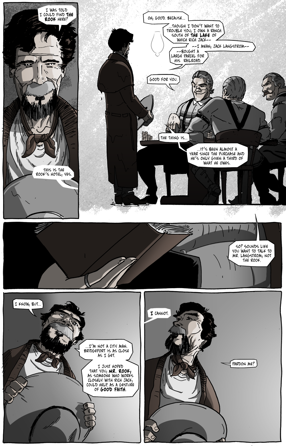
Today’s page is an important one in terms of establishing some context for the world of Long John, we learn more about Rich Jack Langstrom and The Rook is name-checked again. But the characters who deliver this information––and who this scene is about––are people we don’t know at all. So, I tried to create a scene that sold an emotional moment that we could connect to and understand, even though we don’t know who these people are. In panel 2, I wanted to get across that the visitor introduced over the last few pages is older, tired, and uncomfortable. With hope, his posture conveys that. With the cronies at the table, I wanted to make it clear that they were on their home turf: relaxed, confident, and cocky. Again, with hope, their poses come across.
But what does “tired” look like? Or “confident” or “relaxed”? The best way to convey those adjectives is through how they’re interacting with their world. The visitor’s feet are close together, his posture mostly straight except for his slouched shoulders and slightly sagging head. The cronies lean back in their chairs, their seated posture is open, their arms resting on their knees or on their chair or the table.
It’s a fun experiment, taking the time to draw a person leaning back in their chair and have it look “right. There was a lot of that on this page and I think––especially that second panel––I succeeded in a way that I’m quite proud of. Even thought these are characters we don’t know, we get a full read of the situation and the part each person plays in it right away, and all the text on the page suddenly carries more weight in the mind of the reader.


D. Bethel: I’ve enjoyed your comic, “Long John,” so much and for so long, I just had to pass it on to my readers. Thanks for allowing me to. Hope my summary and the panels I chose does it justice. All the best and I look forward to future episodes…. Chris Ayers of unionsuitlimelight.blogspot.com
It’s a very thoughtful overview of the comic. Thanks for sharing!
For those wondering, check out what Chris wrote about Long John here:
https://unionsuitlimelight.blogspot.com/2020/04/partv-undressed-under-duress-long-john.html
Upon reflection, I added a few more sentences to my posting: as “Long John” developed, however, it has become more than “a cowboy in his underwear.”
….The underlying themes of Bethel’s comic for me is much more. He adroitly establishes his character’s union suit as his armor. This knight must now go through life, puzzled but determined. Yes, a knight. Maybe not one in shining armor but a type of armor none the less. Instead of a lance, he utilizes a fast gun and his fists. His quest is not a dragon or a damsel in distress but a desire to find out who he is, what’s to become of him. Don’t we sometimes go through life “undressed under duress?”
Bethel says the development of his protagonist was a “surprising and rewarding experience.” He first met Long John in a 2002 dream. For me “Long John” is like my dream where I appear in public in just my underwear or, horrors, naked. Enjoy Bethel’s “Long John” and see if you don’t relate… Chris