A Cold Welcome
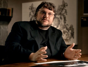
One of the people I’ve learned the most from recently––in terms of how aesthetics, theme, and composition all come together––is filmmaker Guillermo Del Toro. His director’s commentaries are veritable Master’s classes in shot composition and theme development, and even though you could argue that there is a GDT “style” that pervades every movie he makes, the one constant between everything is his attention to thematic––and literal––detail (not to mention, his accent is a lot of fun to listen to). He treats all his movies with the same amount of veracity and earnestness whether they are subtle ghost stories that take place during the Spanish Civil War or are about gigantic robots punching gigantic monsters.
One thing he emphasizes is the idea of expressive or reflective composition––that is, the composition of a shot (or, in my case, the panel or even the page) can and, more importantly, should mirror the state and story of the protagonist. Del Toro was very influenced by the Symbolism movement in art and literature. Visually, it is a movement that relied heavily on composition and mythology to not only create an affective painting, but to have that painting––that single image––tell a story within the boundaries of the canvas.
This means relying not only on the basics of design and composition, but also on cultural associations with various symbols of things both real and imaginary. Everything in a Symbolist painting must have a pragmatic reason for being there (within context), and everything should also have a meaning greater than its pragmatic value in order to appeal to an audience larger than the artist herself and to make the story of the painting clear and concrete. Del Toro talks a lot about this kind of thing in his book, Cabinet of Curiosities, which reprints many of his volumes of illustrated (dare I say, illuminated?) journals he has kept throughout his life which, for the book, have been augmented with thoughtful commentary.
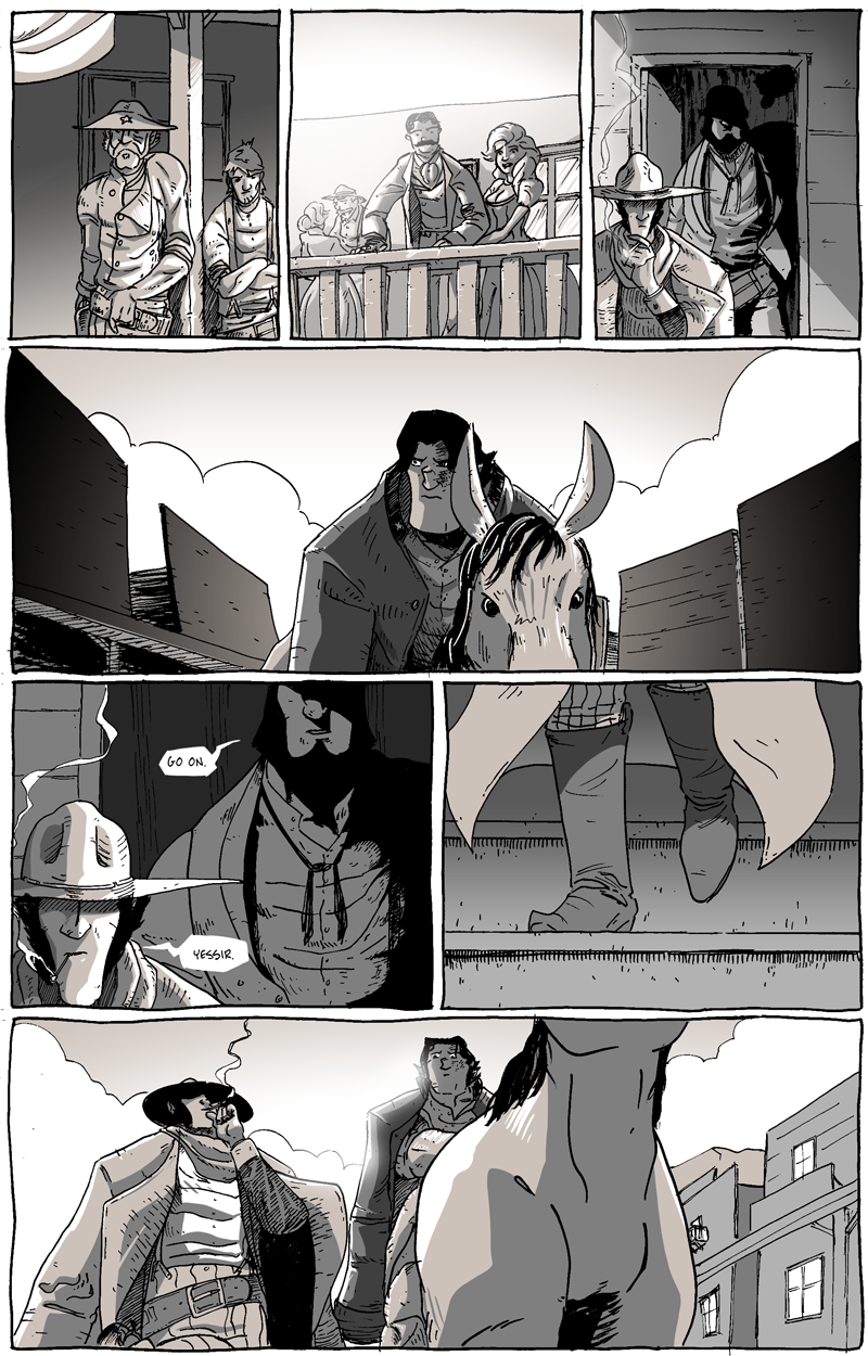
Am I a Symbolist? No, not really. However, there are values and goals within that movement that I have tried to apply to Long John. Without giving anything away, or trying to tell you what Long John is “about”, one element being reinforced throughout the early chapters of the comic is to always place Long John in the middle of strong parallel lines, evocative of a variety of possible themes––and they all may be valid. This page shows that element quite clearly in panel 4 (the second row); the idea of having “widescreen” panels in which Long John was “trapped” and confined greatly appealed to me and helped open up my understanding of the character quite a bit.
All that aside, artists are weird. We tend to like the seemingly innocuous or small elements of a work more than, perhaps, the most technical aspects of a drawing. For me, panel six (second panel, third row) is one of my most favorite things I’ve ever drawn. I don’t know why, but I think it’s rad.


Discussion (2) ¬