The Art of Inking
This is a mild repost from before. My time has been so taken up by maintaining my day job that I’ve only been able to poke at a single comic page over the last two or so months.
That page, however, was sewn up this week and it continues a trend I’ve been noticing with the pages in this chapter––I am really liking how my inks look.

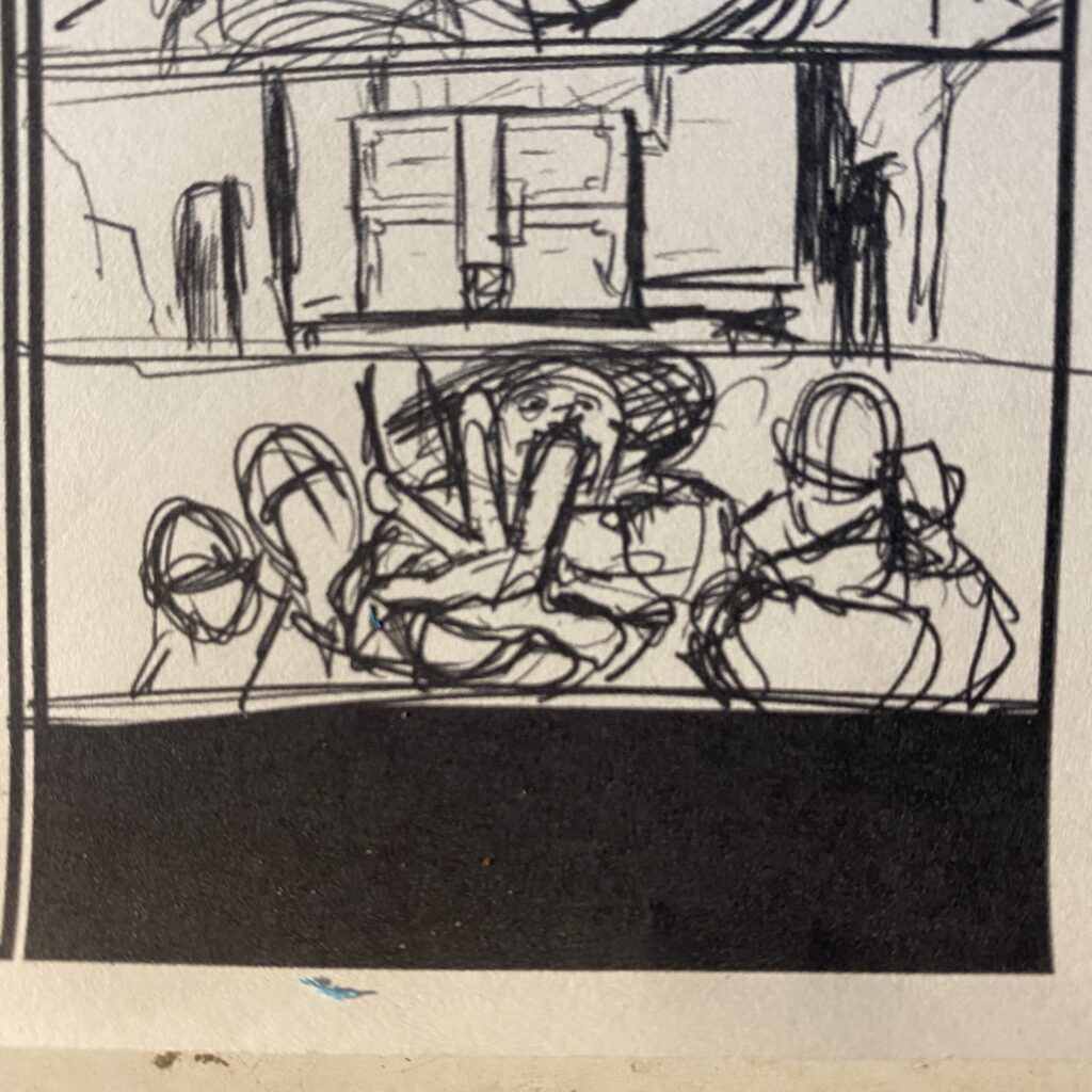
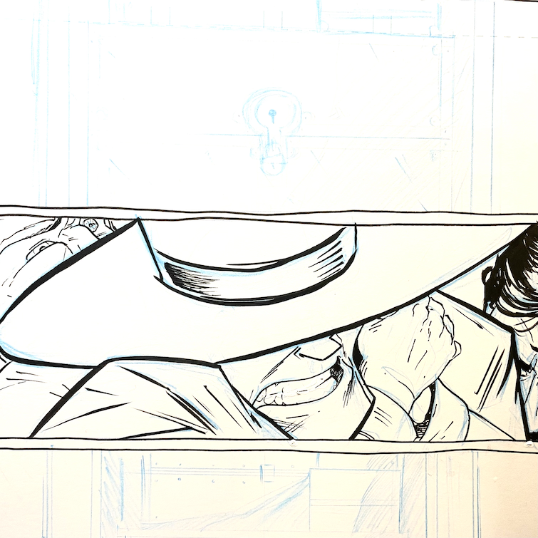
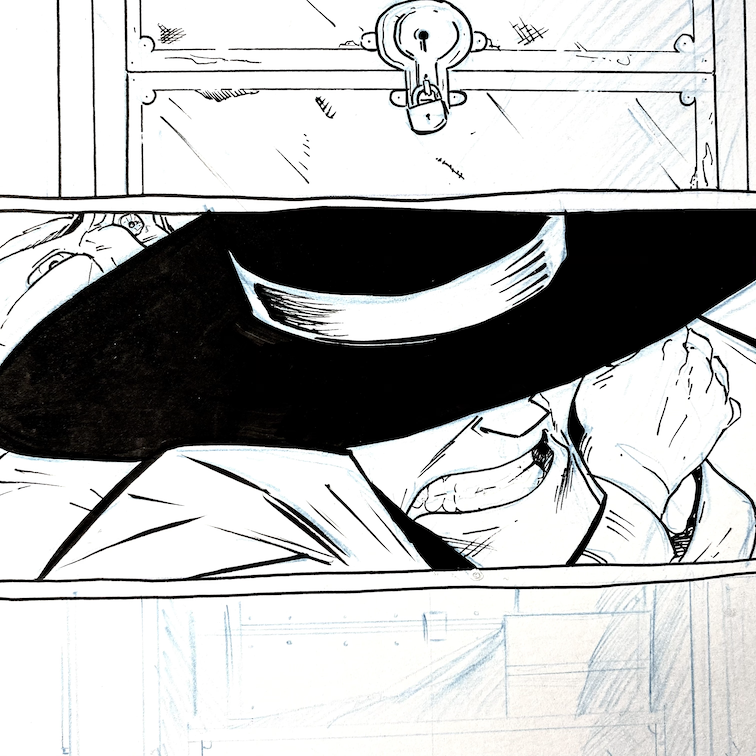
The thing is these nice-looking pages make me a little sad. There was a deliberate choice at the beginning of Long John to keep the inking sketchy and hatched and loose. The idea has generally fallen by the wayside, especially as more brushwork got introduced, and a more thick-to-thin animation-style line (akin to the linework of my previous comic, one which was very inspired by animation) has taken over.

The problem––if it’s a problem––is that I really like how the pages for Chapter 5 are looking. There is a difference between aesthetic and style––one is natural and the other can be forced. Artists aim for the sweet spot where the two intersect. Only five chapters in I feel I’m finding that aesthetic sweet spot not only with Long John but with my own style. I am finding the margins of my stylistic ease and find between those boundaries a very large field upon which I can play.

I guess I’m proud that it took me over 130 pages to learn this, since that amount of pages proved to me that I was liberal in my experimentation––testing to fences to establish my limits (for this story, at least).
In the end, this page is probably one of my most well-executed pages of Long John, artistically, despite the fact that it is actually kind of boring––a page to transition from one scene to the next. But it looks good, and I’m excited to see how this more confident inking manifests in future pages of a chapter that is coming together in a really concrete and clear way.

Discussion ¬